Why Colour Theory Still Matters in Everyday Design
Most people choose a colour because they like it. But designers think about colour in a much more deliberate way. Colour theory — the study of how colours work together and how they affect us — has been around for centuries, yet it still shapes everything from the clothes we wear to the apps on our phones.
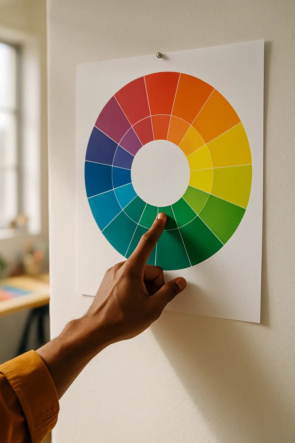
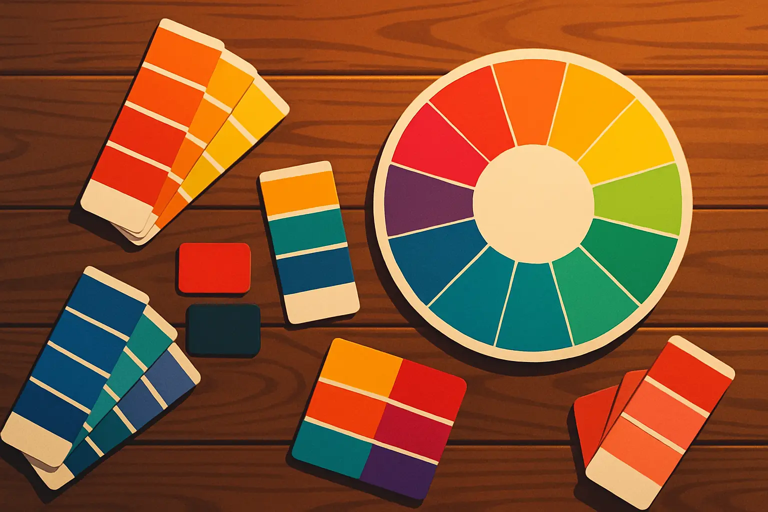
At its heart, colour theory is built around the colour wheel, a simple tool that shows how colours relate to each other. Colours that sit opposite each other on the wheel, like blue and orange, create a strong contrast and grab your attention. Colours that sit next to each other, like green and yellow, feel calm and harmonious. Designers use these relationships all the time to guide your eye, set a mood, or send a message. Red, for example, is often used to signal urgency or energy, while blue tends to suggest trust and calm. This is no accident — it is a conscious choice.
Beyond the basics, colour also carries cultural meaning. White stands for purity in some countries, but it is the colour of mourning in others. A clever designer always considers the audience. The good news for non-designers is that understanding even a little colour theory can sharpen your eye for beauty and help you make better choices in your own life — whether you are decorating a room, putting together an outfit, or simply noticing the world around you with fresh eyes.