Why Ugly Design Is Having a Moment
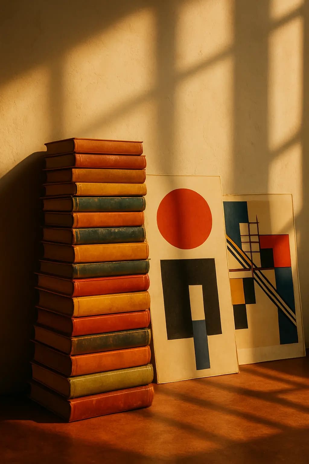
For most of the twentieth century, the dominant ideal in design was clarity. Good design, we were told, should be functional, elegant, and invisible — it should solve a problem without drawing attention to itself. The Bauhaus movement in Germany, the minimalist tendencies of Scandinavian furniture, and the clean lines of Apple's early products all embodied this belief. Beauty, in this tradition, meant restraint.

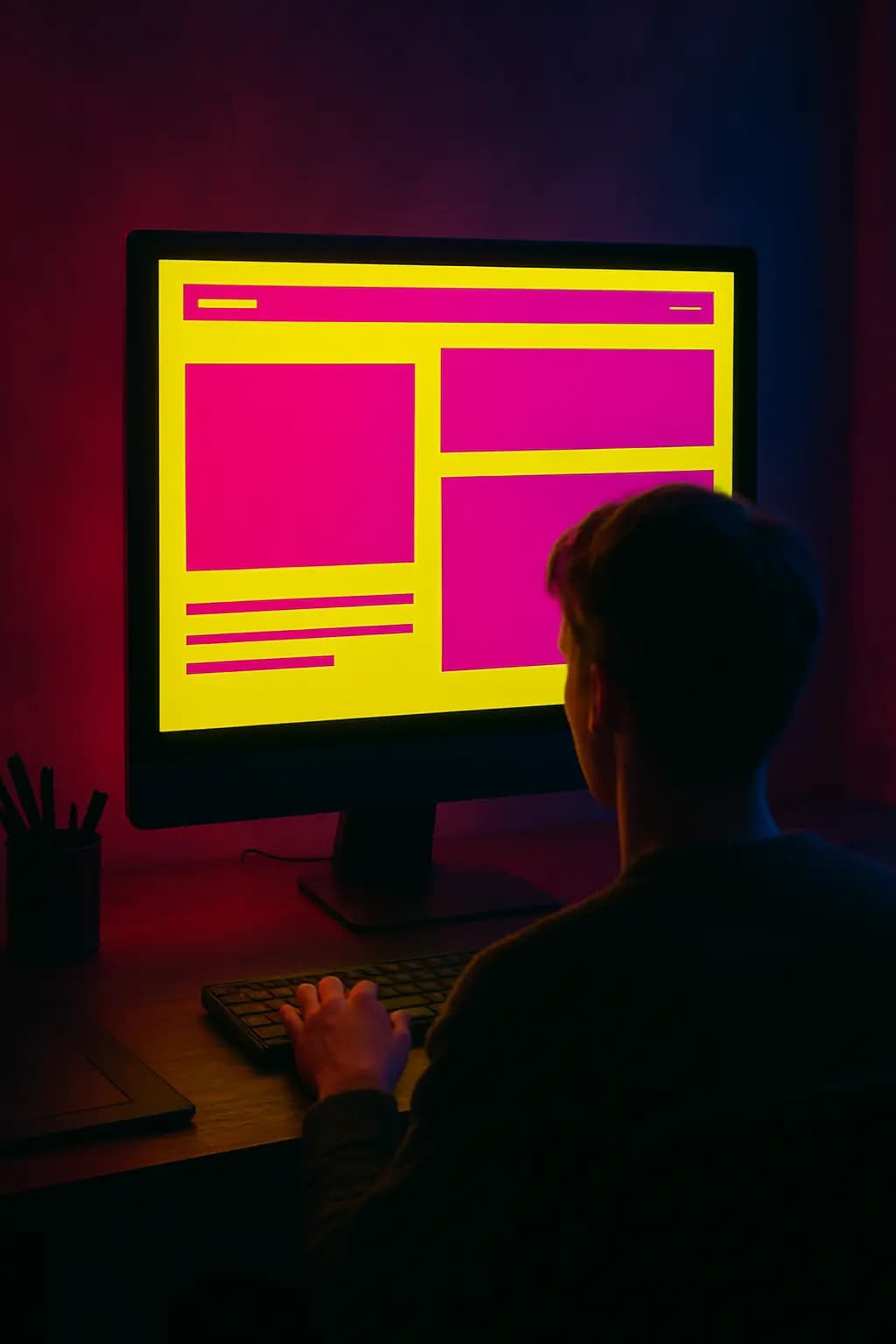
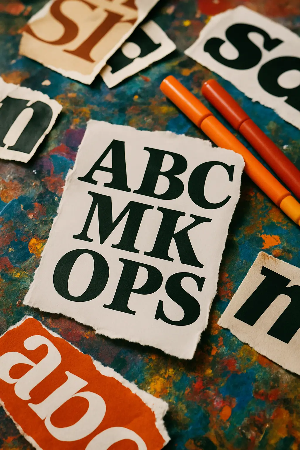
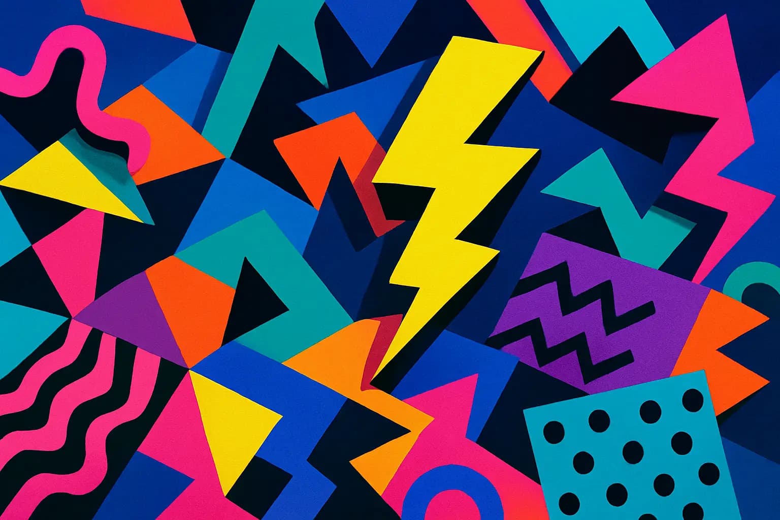
In recent years, however, a counter-movement has been quietly gaining ground. Designers, particularly in graphic design and digital interfaces, have begun deliberately embracing what critics once dismissed as "bad taste": clashing colours, mismatched fonts, asymmetrical layouts, and intentional visual noise. This aesthetic — variously called "anti-design", "brutalist web design", or simply ugly design — rejects the polished perfection of the mainstream in favour of something rawer and more confrontational. Far from being accidental, the ugliness is the point.
What drives this shift? Partly it is a reaction to oversaturation. When every brand adopts the same sans-serif typeface and the same muted palette of sage green and dusty rose, a website that screams in bright yellow Comic Sans stands out precisely because it breaks the rules. There is also a deeper philosophical motivation. Practitioners of anti-design argue that conventional aesthetics, however pleasing, can mask corporate blandness or conceal a lack of genuine ideas beneath a polished surface. Ugliness, by contrast, feels honest — even defiant. It signals that a designer is willing to prioritise voice over approval.